Artist Spotlight: Interview with Trailblazing Generative Artist LIA
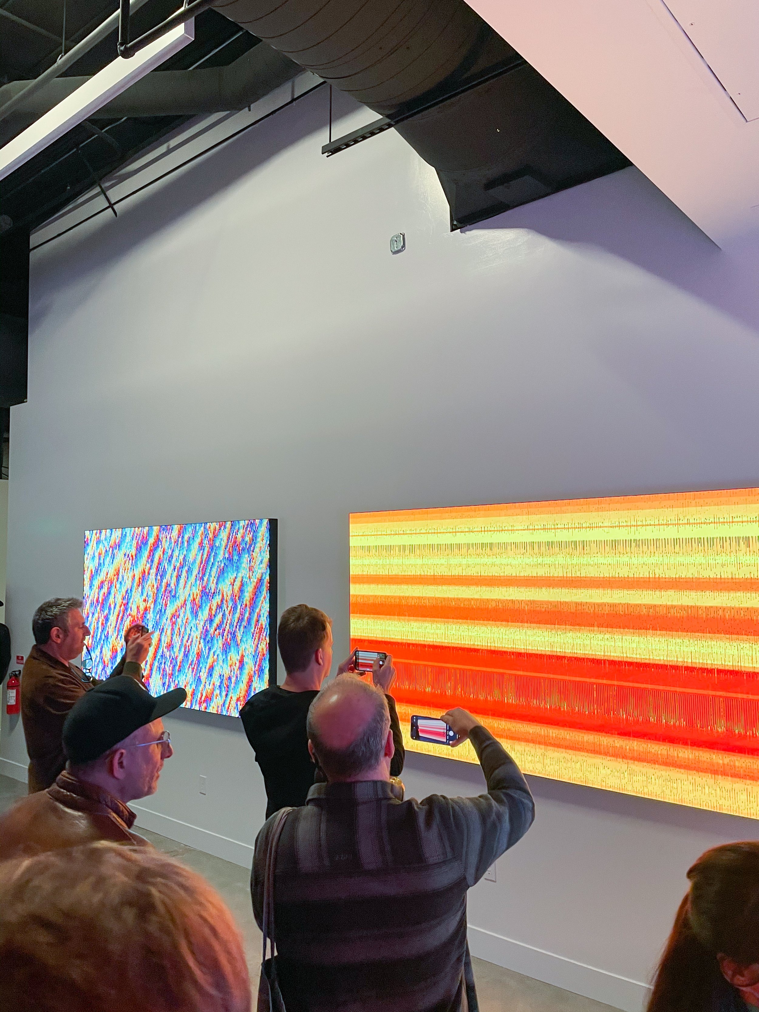
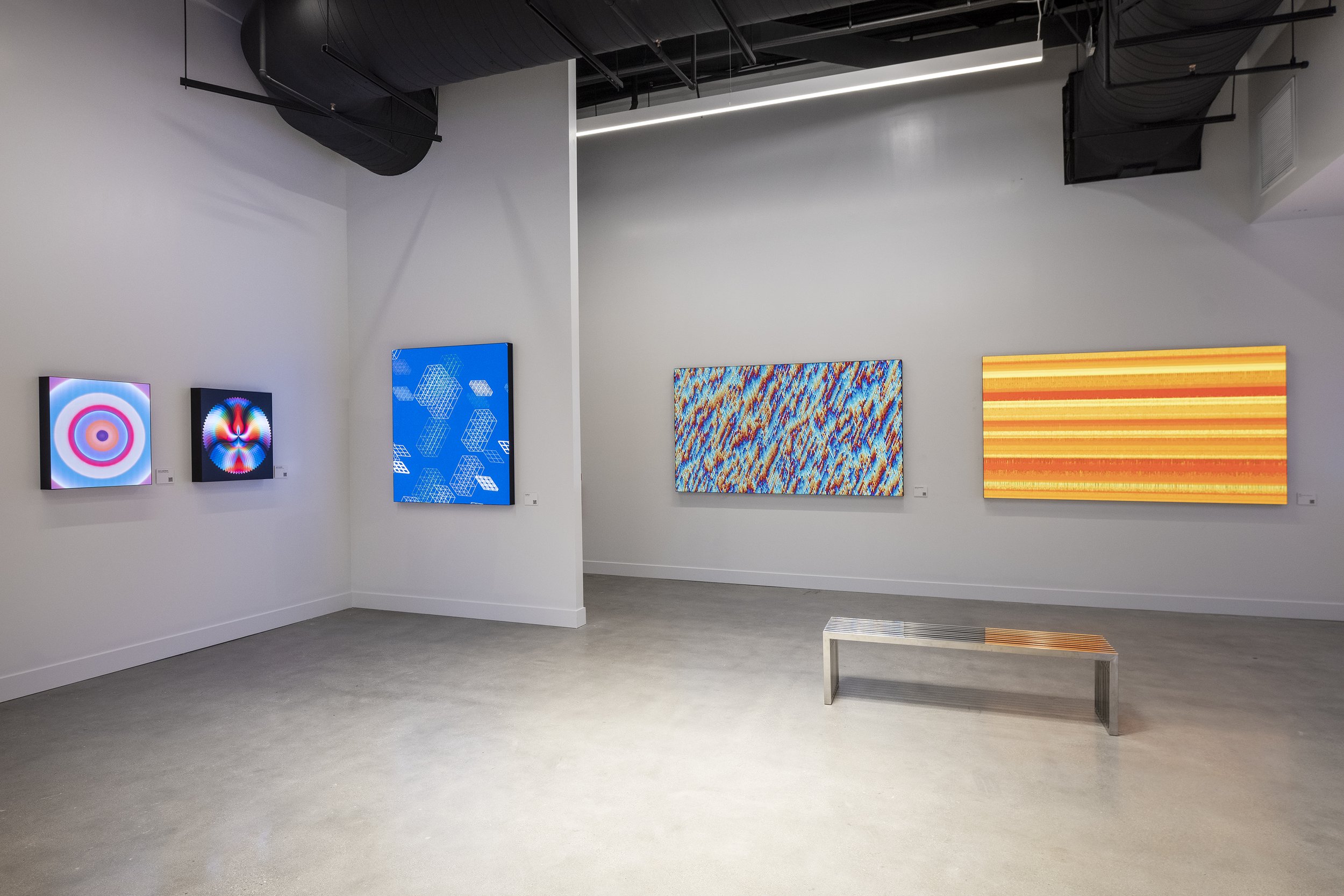
We got to chat with LIA about her beginnings in creative coding and LIA’s artwork for Color :: Field, The Remnants of Movement, is available exclusively on SuperRare and can be purchased here.
“The Remnance of Movement”, 2021
You are considered to be one of the earliest innovators of software art. You’ve been creating with code since the mid 90s. How did you first get into generative art? I imagine the abilities of software for creative coding back then was much more limiting than it is now.
I wouldn’t call myself the earliest, but rather one of the first of the “second generation.” The earliest generative artists worked already in the 60’s and 70’s. I came to generative art in the 90’s, more or less by accident. I was doing some freelance photoshop work for a multimedia company. On one of my visits to their office to drop off a Zip drive full of images I saw someone programming a CD-Rom — I was immediately fascinated by the idea that it was possible to control the movement of elements on the screen via code. I was so excited that I taught myself the coding language Lingo by copying out the entire Macromedia Director handbook by hand, twice — this was how I learnt what a “function” is.
Director was a very powerful programme, so the software was not really limiting at all as you suggested, but because it had a lot of different windows with different functions it took some time to learn how to actually use it. Today of course it is much easier to get started with generative art, there are tons of online tutorials and lots of online communities to help.
Some of my earlier works can be seen here: www.turux.net and here: www.re-move.org
A lot of the patterns and forms in your work feel very organic. Where do you draw inspiration from?
I’m a very visual person and I am inspired by the things I see around me in the world — basically anything can form the basis of one of my pieces. It might be a pattern that I notice, in nature or in the city or wherever, or it might be something interesting I see like light shining through a glass of water, or a distorted reflection in a window. I am always looking around and sometimes I notice things or feel things that I want to try and recreate in code.
When I see these sorts of things that I find interesting, then I try to translate them into ideas, into what I call “principles”, basic ideas like attraction, repulsion, emptiness or fullness as examples. I try to reproduce these things in code, hoping that the original thing or how it spoke to me when I first saw is reflected in the visuals that the code produces, so that maybe someone in the audience will see it too. Or perhaps they will have their own response. It’s a process of iteration and adjustment, and sometimes the finished work will be very far away from the original source of inspiration, but sometimes it can be quite close as well.
Do you ever consider color theory when creating or do you usually choose colors more on instinct and feeling?
I mainly use my instincts to decide on the colors that I use, but my instincts are honed by experience. As a little kid I invented a kind of abstract drawing method, where I used a pencil sharpener to produce colored pencil dust in various colors, and then used my fingers to mix them on the drawing paper. It would make these beautiful areas of color that would merge into each other on the edges. I just loved doing this!
Some of your works are black and white while others are extremely colorful, how do you decide what is and isn’t going to have color? Does it depend on the concept?
In my early computer days monitors only had 256 colors, so most of my early works are mostly monochrome with only a few additional colors, because I considered this better looking than an ugly mix of 256 colors. So, in the beginning my focus was more on the form. It was only in later years that I started to use a lot of color as well. The decision for whether to use mainly black and white or a lot of colors depends on what I want. Sometimes I want to concentrate on the shape and on the movement, and then I tend to avoid color because I would find it disturbing. But the concept behind the work also plays a part in deciding to restrict the colors to black and white. In my work "Winter" I tried to simply translate what winter looks like in Austria to generative art: most trees lose their leaves, there is really not much out there in nature that stays green, so everything actually looks black and white, only with some shades of dirt every now and then. Whereas in my work "Spring" I use a lot of colors, because when everything starts blooming in spring, there is just a lot of intense, young, fresh colors everywhere.
Do you think that color in digital art has the ability to penetrate our subconscious mind and tap into certain feelings and emotions deeper than physical art?
This question is hard to answer, because of the definitions of physical and digital art. Is an immersive Olafur Eliasson light installation digital or physical, and does it matter? I think that color definitively can set a mood and it can affect your feelings, but I don’t think it is the digital or physical nature of an artwork that does this. Size is also very important. It makes a big difference if you see the same artwork very tiny on your phone or on a huge LED wall — of course you will be affected differently.
A big part of the Color Field movement in the 20th century was about the techniques being used to apply color on a canvas. Artists like Mark Rothko and Helen Frankenthaler were inventing new ways to apply color to produce works that were minimal but extremely visceral and profound. Since generative art is normally considered as painting with code, how do you think code is revolutionizing color application?
I think it is not so much the code that is changing how color is used with digital artworks, but more the fact that when using a high resolution monitor or a high resolution LED wall, then you can have a very clean surface with basically no structure. The pixels that make up the smallest drawing unit in a digital artwork are very tiny these days — this can lead to completely different works. With my "Monochrome(s)" series I was playing with this fact for instance: https://www.liaworks.com/theprojects/monochromes/
Also, when you think about the gradient works by Cory Arcangel, digitally they are absolutely perfect, but they are still hard to print to the same perfection. One speck of dust and you are not getting anything nearly as perfect as it was in the digital form.
What is the philosophy behind your work? Is there anything you want viewers to feel in particular?
In general I don’t want to have any say on what a viewer ought to feel or see when they look at my work or interact with it. I want people to come to it on their own terms, to cultivate their own responses. In a way I am trying to educate people to trust their own instincts, to come up with their own personal responses, not just to see and feel what others are telling you to see and feel. I always found it strange when the description of an artwork told me how I should experience this piece of art, because far too often I simply did not feel the same way like the description seems to be suggesting. Someone might love a particular artwork, but the next person will not be touched by it at all — and that should be totally ok. By not giving instruction on how to experience my work I want to give the viewer the freedom to let their imagination go wild. I love it when people tell me what they see in my abstract art — It’s really interesting, and also fun, because sometimes people see things that I had never imagined were there!
The Remnants of Movement, on view at Color :: Field, can be purchased here.
Austrian artist LIA is considered one of the pioneers of software and net art and has been producing works since 1995. Her practice spans across video, performance, software, installations, sculpture, projections and digital applications.
LIA’s works combine traditions of drawing and painting with the aesthetics of digital images and algorithms, characterized by a minimalist quality and by an affinity with conceptual art. She focuses on the translation of certain experienced principles into abstract forms, movements and colours in order to allow the viewer to explore the same on a subconscious level.


